He was there to learn accounting, not comment on my course design. But midway through a Zoom call in the fall of 2025, one of my online adult learners paused and started talking about my Canvas homepage, how the buttons worked, how everything connected. He had taken screenshots and sent them to a former professor at another university. He wanted to show someone what a course could look like.
That moment clarified something I had been working towards for a few years and it finally came together: building a deliberate visual brand for each of my courses. Not a logo in the marketing sense, but a cohesive design identity that gives students a consistent, recognizable experience from the moment they open a Canvas page, one that is not only intentional and professional, but accessible to all learners from the start.
Where the Idea Came From
The spark for my first branded course came from an unlikely place: the Association of Certified Fraud Examiners (ACFE) Global Conference. I had been attending for years, and the conference design caught my eye. The website, the materials, the visual language all worked together to communicate professionalism and credibility before a single session began. I came back to my course and looked at it with different eyes. It was functional, yes. But it did not communicate anything about what kind of experience students were walking into. I decided to change that.
I also had an advantage most instructors do not: my daughter is a professional graphic designer and she happens to focus on designing for accessibility. I am not too proud to ask for help, and the design of my courses is better because of that collaboration. She created a color sheet and font recommendations, helped me troubleshoot my HTML coding, and introduced me to design principles I had never considered. She explained the Z-pattern, the way a reader’s eye naturally moves across a page, and showed me where to place elements for the most visual impact. She also pushed me toward certain color palettes based on color theory, a small choice that gives a course a more welcoming feel.
The result was a course with bold, bright colors and a banner that tells the story of accounting: data, community, money, and reports. It does not look like a default Canvas page. It looks like it tells a story without words. (See Figure 1)
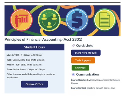
Figure 1
Three Courses, Three Identities
Each course I teach has its own design origin story, and they are all different.
For ACCT 2302, Principles of Managerial Accounting, I wanted a manufacturing feel. Managerial accounting lives in the world of production, cost, and process, and I wanted the course to reflect that. We landed on a gear-based banner and a softer color palette, a different visual register than the bold energy of financial accounting. The homepage layout is also structured differently, a reminder that you can make intentional choices to distinguish one course from another rather than defaulting to a template. (See Figure 2)
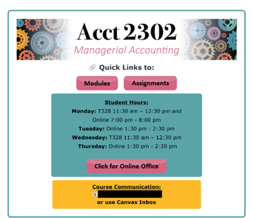
Figure 2
For ACNT 2311, Managerial Accounting, I handed the creative lead to my daughter entirely and asked for something sophisticated and polished. She built the color palette from a photograph she had taken herself, then designed the banner and made typography recommendations. This course has a synchronous lecture component which needed to be separate from the online office hours link. (See Figure 3)
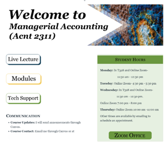
Figure 3
What all three courses share is structural consistency beneath the visual differences. Students moving between my courses will find the same organizational logic, the same navigation patterns, the same underlying architecture. The brand of each course is distinct, but the experience of being in one of my courses is recognizable.
Why This Matters Beyond Making It Pretty
Intentional course design is about access. When a student opens a course page and the layout is consistent, the visual hierarchy is clear, and the typography is readable, they spend less mental energy orienting themselves and more mental energy on the content. That is not a small thing for an adult learner managing a job and a family and logging in at ten o’clock at night or a neurodivergent student. Good design removes barriers before the first assignment loads.
Universal Design for Learning asks us to anticipate the full range of learners in our courses and build for them from the start rather than accommodating them after the fact. Visual design is one place where that principle is immediately actionable. For example, font choice affects readability for dyslexic learners, and color contrast matters for students with low vision. A clear, predictable layout reduces cognitive load for students with attention or processing differences. These are not advanced accessibility interventions. They are basic design decisions that benefit every student in the course.
There is also something to be said for the environment that thoughtful design creates. Years of attending various industry conferences taught me what it feels like to walk into a professional setting designed with purpose. I wanted my students to feel that same thing, that they are somewhere serious, somewhere that respects their time and their ambitions.
Where to Start if You Are Not a Designer
You do not need a daughter with a graphic design degree. But you do need to start somewhere, and the most useful first question is simply: what does this course feel like? Not what does it cover, but what is the experience of being in it? From that question, a theme often follows naturally. A nursing ethics course might have a very different visual personality than a data analytics course, and naming that difference is the beginning of a design identity.
A few practical steps to get you started:
- Let the content suggest the palette. Think about the world your discipline lives in and let that guide your visual choices. The subject matter already has a visual language; your job is to find it.
- Borrow from contexts you already trust. Look at conferences, professional organizations, or publications in your field and pay attention to how they present themselves. Those materials gave me a visual reference point I could adapt rather than invent, and they will do the same for you.
- Think about structure separately from style. The colors and banners are the personality; the navigation and organizational logic are the bones. Get the bones right first, then dress them.
- Build for your hardest-to-reach student. Ask yourself whether your font is readable, your color contrast is sufficient, and your layout is predictable enough for someone navigating the course at 2 am because we have all received those early morning emails! If the answer is yes, the design is working for everyone.
And if you have access to expertise, whether a colleague in graphic design, an instructional designer, or someone in your own family with an eye for this work, do not be too proud to ask for it. The best design decisions I have made came from conversations with someone who thinks about visual communication professionally. Those conversations changed how I see my own courses. A few free tools worth bookmarking as you get started:
Chat GPT- Custom GPTs for HTML and Canvas:
Make Your Course a Brand
Every course communicates something visually. Course branding is not decoration. It is a way to bring personality, professionalism, and purpose into the space where learning happens and to make sure that space is built for everyone who walks into it.
Jennifer Coon, CIA, CFE, is a Professor of Accounting at Tyler Junior College, where she was named the 2025 Endowed Chair for Teaching Excellence, and an adjunct accounting instructor at Collin College. She brings the lenses of a Certified Internal Auditor and Certified Fraud Examiner into her principles-level courses and writes about course design, gamification, and practitioner identity in the accounting classroom.