As online learning becomes more prevalent in higher education and professional development, User Experience (UX) and User Interface (UI) design have become essential to the effectiveness of digital learning environments (Tawfik, 2020; Quintana, 2020). UX includes users’ perceptions and responses to a system and is shaped by factors such as usability, functionality, and context of interaction (Zaharias, 2012). UI refers to the visual presentation and interactive features that support access to and interpretation of information within the learning environment (Kishabale, 2021).
In e-learning settings, UI/UX design significantly influences student experience and learning effectiveness (Miya, 2022). Well-designed interfaces can reduce confusion, frustration, and cognitive strain while promoting efficiency, engagement, and successful learning outcomes (Dekock, 2016; Kishabale, 2021). Poor design, however, can distract students, increase stress, and shift attention away from meaningful learning activities toward navigation challenges (Kishabale, 2021; Tawfik, 2020; Gregg, 2020). Research also indicates that ineffective UX can contribute to negative experiences such as mind-wandering and decreased focus on instructional content (Wong, 2024).
Students widely view UI/UX design as a vital component of online learning platforms, and many report encountering poor design in educational settings (Chaganti, 2023). Strong UI/UX design helps direct attention toward learning tasks rather than platform navigation and has been associated with increased engagement, reduced mind-wandering, and improved learning outcomes (Chaganti, 2023; Wong, 2024). For these reasons, prioritizing effective UI/UX design is critical to supporting motivation, participation, and success in online learning environments.
Why This Matters in Online Learning
User Experience (UX) and User Interface (UI) design are essential in online learning environments such as Learning Management Systems (LMS) (Chaganti, 2023). UI refers to the screen design that supports access to and perception of information, while UX includes users’ perceptions and responses to the system, shaped by usability, functionality, internal state, and context of use (Zaharias, 2012).
Effective UX design in an LMS depends on usability, ease of use, and clear organization (Chaganti, 2023). User-friendly layouts, clear instructions, and strong course structure improve perceived usefulness and support learning (Kishabale, 2021; Cho, 2009). Well-designed interfaces also reduce cognitive load, allowing students to focus on instructional content rather than navigation difficulties (Borges, 2016; Kishabale, 2021; Nakamura, 2018; Tawfik, 2020). Clear feedback and helpful error messages further strengthen UI quality (Chaganti, 2023).
Beyond usability, visual design, aesthetics, and accessibility also shape learner engagement and satisfaction (Kishabale, 2021; Saleh, 2022). Effective UX addresses both functional and pleasurable dimensions of interaction while supporting inclusivity for diverse learners (Maslov, 2021; Sahid, 2016; Zaharias, 2016). Together, these characteristics help create positive learning experiences that increase motivation, reduce frustration, and support learning outcomes (Kishabale, 2021; Chaganti, 2023; Tawfik, 2020).
Technology Integration into the Classroom’s Design
In figure 1.0, you can see the landing page for Technology Integration in the Classroom. This course was designed using basic features and default layout presented by D2L. This course is taken by students before they enter into Planning and Instruction, the redesigned course. In the Technology Integration course, on the landing page, there are simple navigation links guiding users towards the course content, grades, and assignments. Below is a list of announcements used by the instructor to guide them to the current week’s content.
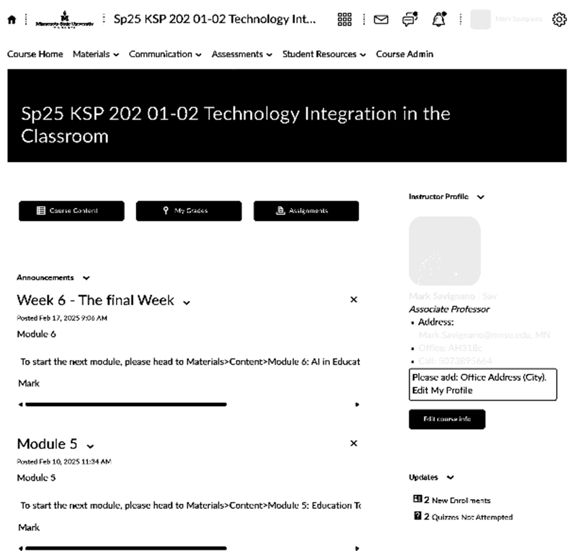
Figure 1.0 – This is a sample learning page from Technology Integration in the Classroom.
From this landing page, if the users click the link provided in the announcements or from the Course Content it takes them to figure 1.1. In this part of the design, students view all of the course’s content in a navigation listing on the left. This listing shows the current week’s con-tent, along with any sub-folders used. In addition, it shows each week’s content following the current week. As you can see in the figure, not all the content can be displayed on the screen, as the sub-folders are expanded to show the user the additional content.
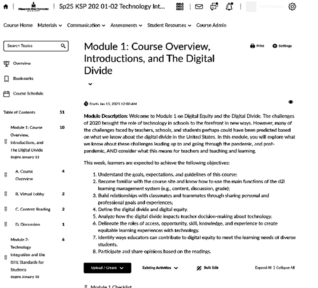
Figure 1.1 – This is a sample of the course materials navigation and current week’s material.
In addition, in figure 1.1 you can see that the current week’s material is displayed. Depending on the instructor’s instructions, or direction, this can move any sub-folders used below the view of the user. As the user scrolls down the page, they can view the sub-folders created and organized by the instructor on how they want to break the lesson down to their different parts. In this case, as seen in figure 1.2, there are at least two sub-folders that separate the Course Overview with Virtual Lobby. As you can notice, D2L informs the user that Course Overview and Virtual Lobby are sub-folders of the week’s content by providing an according style drop down arrow and section box outlining the material within the sub-folder.
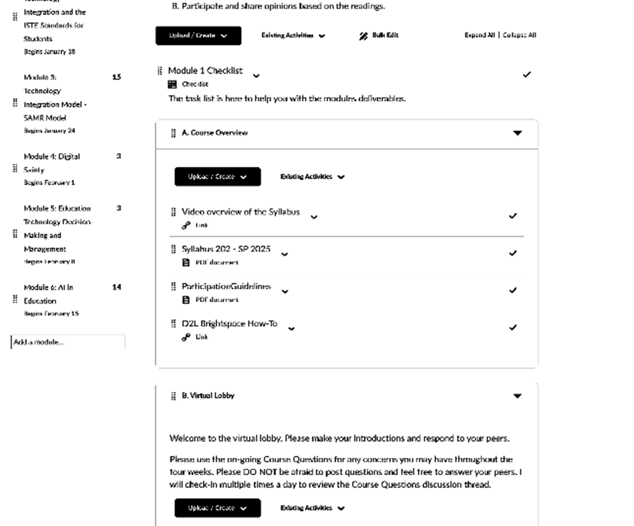
Figure 1.2 – This is the view when students keep scrolling to view the rest of the week’s material.
Once in the sub-folder the user’s view may vary. Depending on how the instructor fills the sub-folder, users might see a view, as seen in Figure 1.3, where there is just text instruction, or Figure 1.4 a PDF view with a navigation bread crumb to provide the user with where they are in the folder. Users could also be met with just a few links as seen in Figure 1.5.
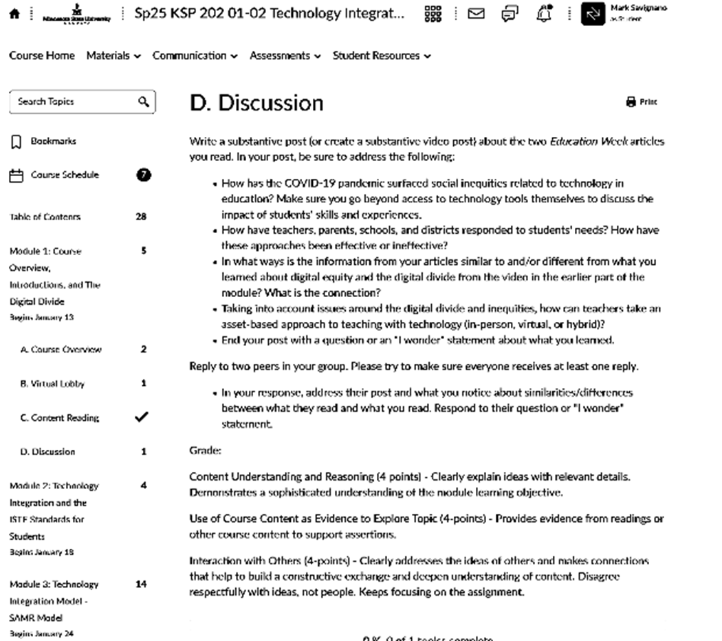
Figure 1.3 – This image is demonstrating text entry ability of D2L for instruction.
In the text description of this sub-module, you can see D2L does not give a bread crumb navi-gation at the top leaving the user to rely on the left-hand links menu. This could provide some signaling for the user to place their place within the module.
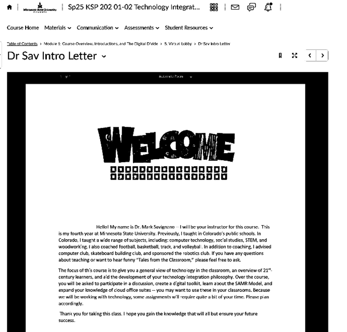
Figure 1.4 – This image is demonstrating the PDF capabilities of D2L.
In figure 1.4, D2L handles the display of PDF in a single window. This PDF page does give the user a bread crumb navigation at the top but eliminates the navigation window to the left. The user may lose the main navigation on the left; they are still able to navigate to the previous page using the bread crumb navigation and know their place within the module at the same time.
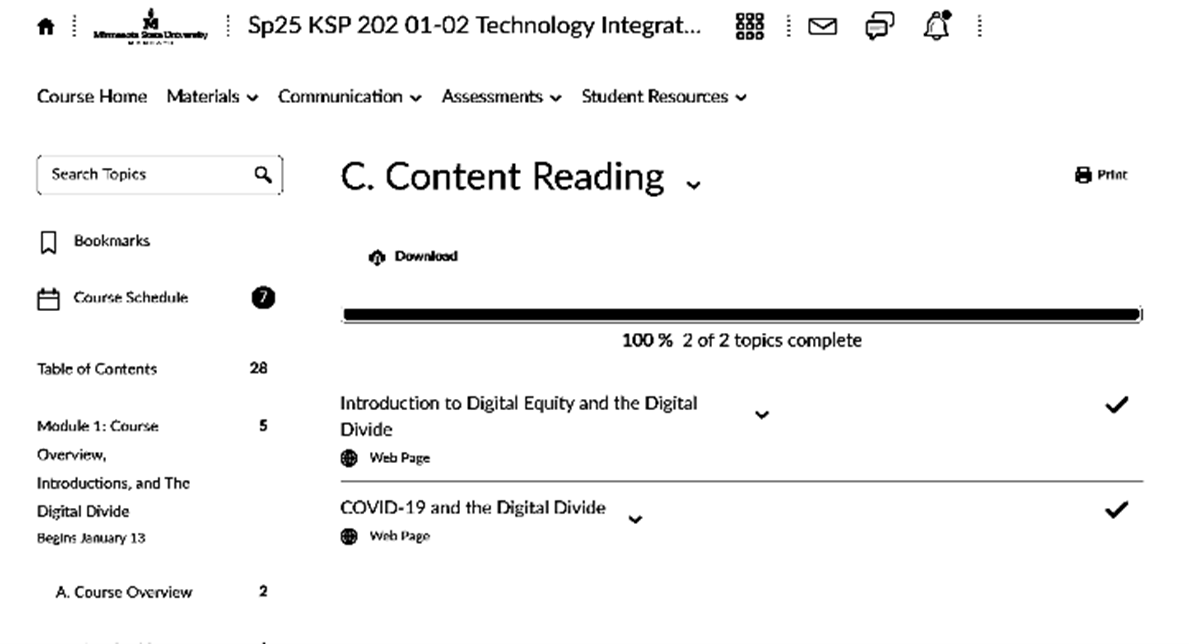
Figure 1.5 – This image is demonstrating the ability to produce content via the HTML template and how it displays to the user.
When instructors use the website template to create content, D2L organizes the sub-folder into links that open a new web browser tab. This current page eliminates the use of bread crumb but maintains the navigation menu to the left. Both the new tab and main navigation menu helps the user know where they are located within the module but can easily navigate to other parts of the course or sub-modules.
Planning and Instruction in the Classroom
Planning and Instruction in the Classroom is a required course in the pre-service teaching program at Minnesota State University, Mankato. The course is generally taken after the Technology Integration course previously detailed. In this research, Planning and Instruction in the Classroom was the course that used HTML templates and design to provide a cleaner, and easily navigable feature. In figure 1.6, you can see the landing page for Planning and Instruction in the Classroom is the same. This provides the user links to the course content, grades, and instructor contact. Below the list of links is the announcement feature that informs the user of new updates.

Figure 1.6 – This image is demonstrating the homepage of Planning and Instruction.
In the next figure, 1.7, is the next page users are taken to once they click course content. On this page, the navigation links to the left are minimized because the module is contained in one link. Relevant information pertaining to the course and week 1 are maintained at the top within the user’s screen giving them the ability to see a greater amount of the course with easier navigation choice
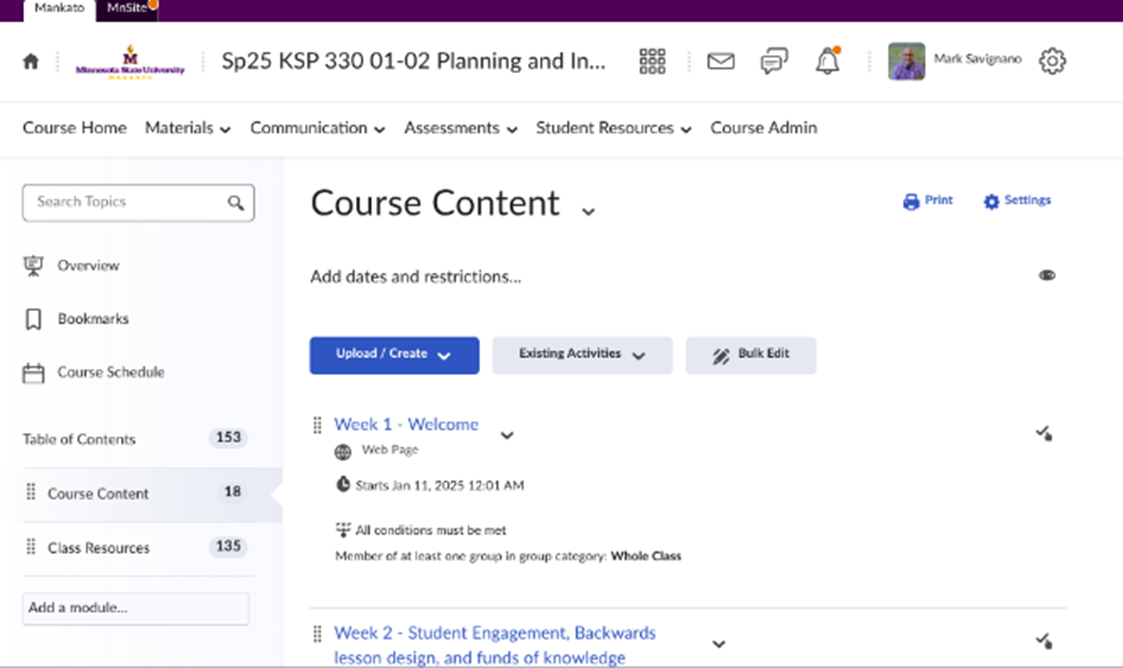
Figure 1.7 – This image is showing the user’s view of the course content.
Once the user selects the week, the next screen takes them to the instructor’s description of the week, with a navigation bread crumb at the top. As seen in figure 1.8, this provides a more balanced approach to displaying the information with a more modern look.
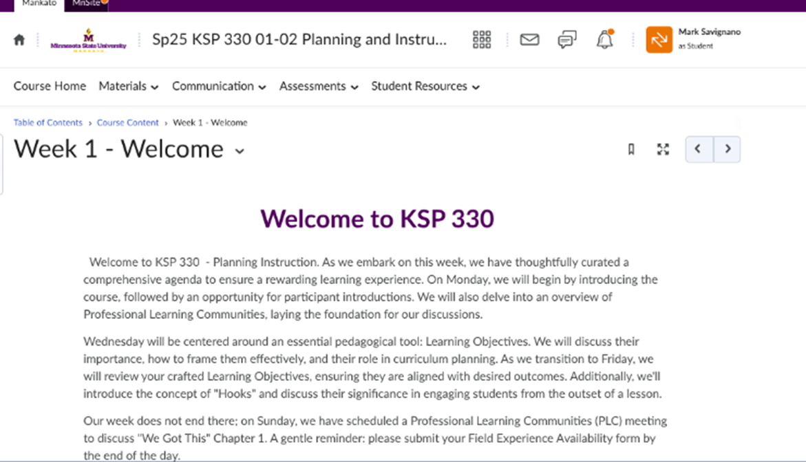
Figure 1.8 – This image is showing the user’s view of the week’s description using the HTML template in D2L.
As the users scroll down, they meet with an accordion style table that holds the assignment submission folders, and weekly content (figure 1.9).
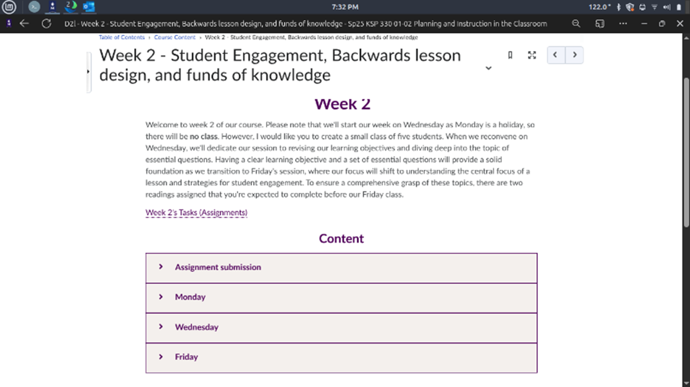
Figure 1.9 – This image is showing the user’s view of the week’s description and accordion style table.
The use of accordion HTML templates gives a more organized layout. Also, when users click on the arrow next to each section in the table, the section expands. In the more basic design discussed in the previous section would take the user to a new page. With accordion layout, the user stays on the same page (figure 1.10).
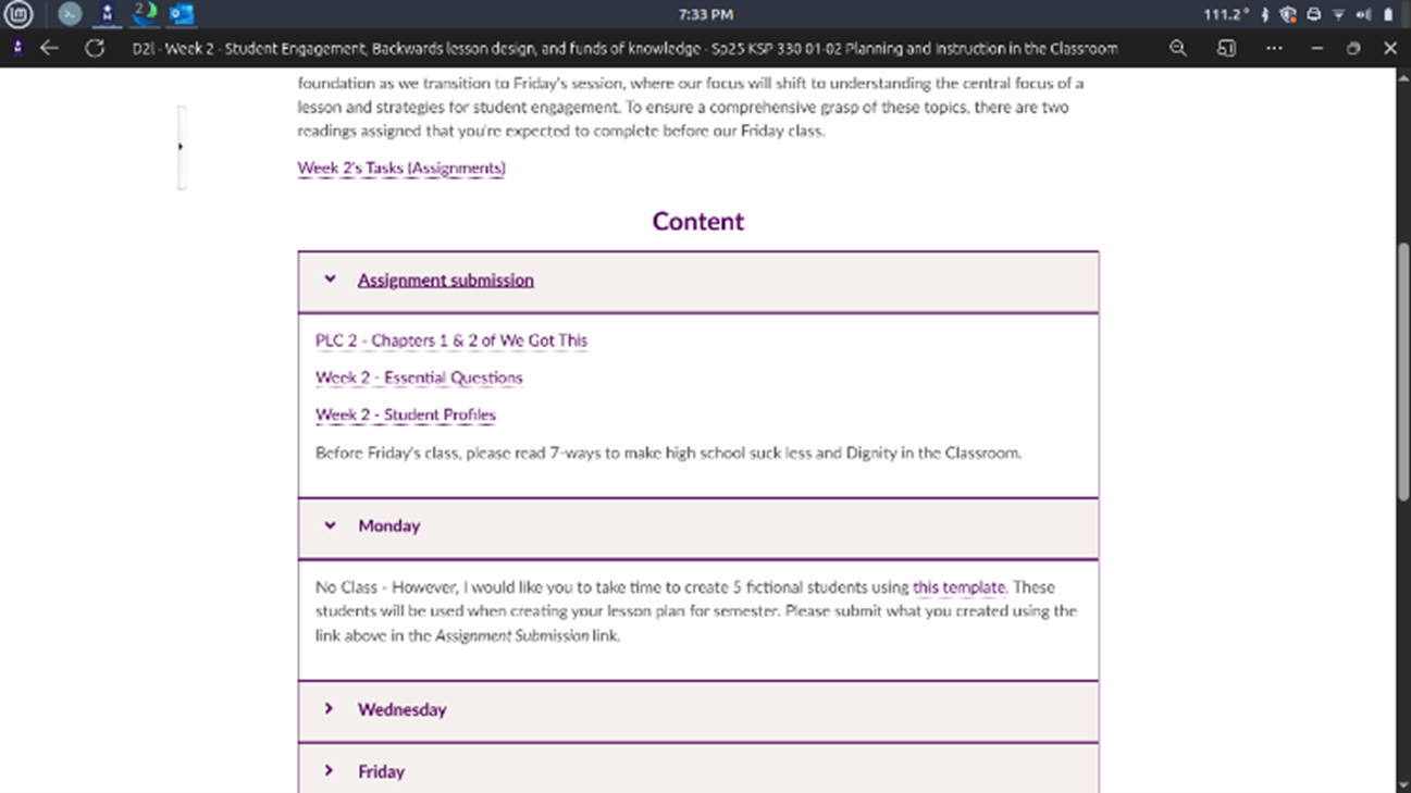
Figure 1.10 – This image is showing the expansion of the accordion style table, showing the user more information.
From here, when the user clicks on a link, it opens up a new tab in their browser. This has a few advantages; users keep their place on the main page of the week’s lesson. Opening a new browser also allows them to switch between tabs to look at information for the week and what the assignment or content is asking. Last, opening a new tab allows the user to know their place in the flow of the lesson content. Once they are done with the information or task within the link, the user just needs to close the tab to return to the week’s homepage. This reduces band-width and response time in requiring the browser to have to reload the week’s homepage data.
Why Better LMS Design Matters
As online learning expands in higher education and professional development, the importance of user experience (UX) and user interface (UI) design has become increasingly clear. These elements strongly influence the effectiveness, accessibility, and overall success of digital learning platforms (Tawfik, 2020; Quintana, 2020). UX refers to users’ perceptions and responses during interaction with a system and is shaped by usability, user characteristics, and context (Zaharias, 2012). UI, by contrast, concerns the visual and interactive features that allow users to access and engage with information (Kishabale, 2021).
In e-learning environments, effective UI/UX design can improve learning by reducing cognitive load, supporting engagement, and helping learners focus on instructional content rather than navigation challenges (Kishabale, 2021; Tawfik, 2020). Intuitive and visually appealing platforms can decrease confusion and frustration, contributing to stronger learning outcomes (Dekock, 2016; Kishabale, 2021). Poor design, however, can distract learners, increase stress, and shift attention away from meaningful learning tasks (Gregg, 2020; Wong, 2024).
Research also shows that students widely recognize the importance of UI/UX in online learning, with negative experiences often linked to poor design (Chaganti, 2023). Important design features include clear navigation, organized structure, timely feedback, visual appeal, and accessibility, all of which contribute to learner satisfaction and inclusivity (Kishabale, 2021; Saleh, 2022). Effective UX supports both functional needs, such as usability and responsiveness, and hedonic needs, such as enjoyment and engagement (Maslov, 2021; Zaharias, 2016).
For these reasons, strong UI/UX design is essential in online education. By reducing barriers to interaction and promoting seamless experiences, well-designed platforms can improve motivation, engagement, satisfaction, and learning outcomes. As digital education continues to evolve, integrating user-centered design principles remains critical to creating accessible and effective online learning environments.
What Students Told Us
The comparative study of UX design in KSP 202 and KSP 330 demonstrates how instructional design influences student engagement and learning outcomes in online courses. By combining qualitative and quantitative survey methods, the study captured both detailed student perspectives and measurable patterns of satisfaction.
A major strength of the study was its mixed-methods approach. KSP 202 used open-ended questions to gather nuanced reflections on student experiences, while KSP 330 used a Likert-scale survey to measure satisfaction across specific areas. Together, these methods provided a broad and detailed understanding of how students perceived each course’s digital learning environment.
Findings showed a strong preference for the KSP 330 design. Approximately 65% of respondents favored the newer layout, citing improved navigation, clearer organization, and stronger visual appeal. Students particularly valued the structured weekly format, embedded submission links, and visual checklists, which supported time management and course navigation.
Quantitative results reinforced these findings. KSP 330 received an average satisfaction rating of 4.7 out of 5 and a comparative score of 4.43 relative to other D2L shells at MNSU, suggesting that students viewed it as above average in quality and usability. These results indicate that the design effectively supported common academic tasks such as assignment submission and discussion participation.
Although feedback was overwhelmingly positive, students also identified areas for improvement, including redundant or missing links, unclear assignment instructions, and a minor adjustment period when transitioning from the KSP 202 format. Open-ended feedback further emphasized appreciation for the course’s organization and ease of use while offering suggestions such as improving accessibility tools and checklist consistency.
Overall, the study shows that thoughtful UX design can improve student satisfaction and support stronger learning outcomes. Although feedback was largely positive, some students noted minor issues, including redundant links, unclear instructions, and a small adjustment period when transitioning from the older design. These concerns suggest the need for ongoing refinement in course design. KSP 330 provides a strong model for future online course development, with student feedback offering guidance for continued refinement.
Overall, the study highlights the importance of intentional UI/UX design in online learning. The KSP 330 course demonstrates how user-centered design can improve satisfaction, reduce cognitive load, and better support student learning outcomes.
Dr. Mark Savignano is an associate professor of Educational Technology at the University of Minnesota, Mankato. His current research interest is in pre-service teacher education, and Virtual Reality in pre-service teacher education. In his free time, he likes to fish, explore breweries, play video games, and raise his two daughters.
Dr. Scott Page holds a Ph.D. in Science Education from Indiana University. A professor at Minnesota State University since 1997, he has served as Department Chair and Coordinator of Professional Education. His background spans curriculum consulting, hands-on science education, and high school teaching in science and computer science.
References
Aldemir, T. (2020). Think-Aloud Observations to Improve Online Course Design: A Case Example and “How-to” Guide.
Borges, M. (2016). User interface and cognitive load: An experiment with interactive geometry software. Computers in Human Behavior, 55(A), 319–328. https://doi.org/10.1016/j.chb.2015.07.064
Chaganti, K. R., Ramula, U. S., & Sathyanarayana, C. (2023). UI/UX Design for Online Learning approach by Predictive Student Experience.
Cho, V. (2009). Perceived user-interface design, perceived usefulness and perceived ease of use: An empirical study of online self-paced e-learning systems. Computers & Education, 53(1), 216–227. https://doi.org/10.1016/j.compedu.2009.01.014
deKock, D. (2016). Exploring user experience of learning management system.
Kishabale, B. (2021). Theorising and Modeling Interface Design Quality and its Predictive Influence on Learners’ Post Adoption Behaviour in E-Learning Course Environments. International Journal of Education and Development using Information and Communication Technology (IJEDICT), 17(1), 100–122.
Maslov, I., Nikou, S., & Hansen, P. (2021). Exploring user experience of learning management system. The International Journal of Information and Learning Technology, 38(4), 344–363. https://doi.org/10.1108/IJILT-03-2021-0046
Miya, T. K., & Govender, I. (2022). UX/UI design of online learning platforms and their impact on learning: A review. INTERNATIONAL JOURNAL OF RESEARCH IN BUSINESS AND SOCIAL SCIENCE, 11(10), 316–327. https://doi.org/10.20525/ijrbs.v11i10.2236
Nakamura, W. T., Marques, L. C., Rivero, L., de Oliveira, E. H., & Conte, T. (2018). Applying Design Science Research to develop a Technique to Evaluate the Usability and User eXperience of Learning Management Systems. In Brazilian Symposium on Computers in Education (SBIE) (Vol. 28, No. 1, p. 953). https://doi.org/10.5753/cbie.sbie.2018.953
Sahid, A. (2016). User experience evaluation of learning management systems: An application of the User Experience Questionnaire (UEQ).
Schmidt, M., Tawfik, A. A., Jahnke, I., Earnshaw, Y., & Huang, R. (2020). Introduction to the edited volume: Learner and user experience research: An introduction for the field of learning design & technology. In M. Schmidt, A. A. Tawfik, I. Jahnke, Y. Earnshaw, & R. Huang (Eds.), Learner and user experience research: An introduction for the field of learning design & technology. EdTech Books. https://edtechbooks.org/ux/introduction_to_ux_lx_in_lidt
Wong, J. T., Chen, E., Au-Yeung, N., Lerner, B. S., & Richland, L. E. (2024). Fostering engaging online learning experiences: Investigating situational interest and mind-wandering as mediators through learning experience design. Education and Information Technologies, 29, 18789–18815. https://doi.org/10.1007/s10639-024-12524-2
Zaharias, P., & Pappas, C. (2016). Quality Management of Learning Management Systems: A User Experience Perspective. Current Issues in Emerging eLearning, 3(1), Article 5.
Zaharias, P., & Mehlenbacher, B. (2012). Exploring User Experience (UX) in virtual learning environments. International Journal of Human-Computer Studies, 70(7), 475–477. https://doi.org/10.1016/j.ijhcs.2012.07.009