Even as in-person classes return post-pandemic, online courses haven’t gone away. In fact, many students still opt for online learning because of the flexibility it offers. But one thing is clear: not all online courses are created equal, and one of the biggest differences lies in something many instructors overlook: the course webpage.
Whether you’re using Brightspace, Canvas, or Moodle, how you design your course webpage can make or break your students’ experience. Based on our systematic review of recent studies on online learning and student satisfaction, here’s what we learned—and how you can apply it in your own teaching.
Why Course Webpages Matter More Than You Think
Students form impressions about your course page in less than a second (Lindgaard et al., 2006). If it’s cluttered, confusing, or bland, you might lose them before they even start the first lecture.
We reviewed research involving over 1,600 university students from seven countries. Across the board, students reported that a course webpage’s ease of use, usefulness, and visual appeal significantly influenced their satisfaction and engagement (Lazard & King, 2020; Younas et al. 2021).
How We Did the Research
To better understand what works in online course webpage design, we conducted a systematic review following PRISMA guidelines. Here’s what that looked like:
- Databases searched: LearnTechLib, Omni (Carleton University), and reference lists from relevant papers
- Keywords: “COVID,” “website,” “online learning,” and “pedagogy”
- Inclusion criteria: Peer-reviewed, quantitative studies from 2020–2023, focused on higher education
- Total included: 7 studies, 1,614 participants across Australia, China, South Africa, Lebanon, Pakistan, Malaysia, and the U.S.
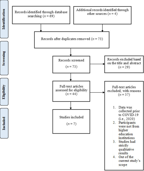
Figure 1. PRISMA Flow Diagram for the Course Webpage Design Search
Practical Tips for Smarter Course Design
Below are research-based, practical tips instructors can use—that don’t require you to be a web designer. These ideas are easy to implement and can make a big difference.
1. Make Navigation a No-Brainer
Think of your course webpage like your storefront. If people can’t find what they need, they won’t stick around. This makes your life as an instructor harder: you will get more students with last-minute requests for accommodations, as well as students struggling with procrastination.
Use a consistent layout, organize materials by weeks or modules, and give each section clear, descriptive titles. Students should never have to hunt for a syllabus or lecture slides (Bachman & Stewart, 2011; Plous, 2000). I found that having a hyperlink directly on the first page of the course website, helped reduce the amount of student emails on syllabus-related questions (a joy).
Pro tip: Use drop-down menus and collapsible folders to reduce visual clutter.
2. Keep It Clean and Simple
Visual overload is real. Too many colours, clashing fonts, or random clipart can be overwhelming. Stick to a minimalist design with just enough contrast and white space to guide the eye. Use consistent font styles and colours to help students focus (Lazard & King, 2020).
Pro-tip: Avoid red text on black backgrounds—students with colour vision deficiencies may struggle with this combo. The Science Communication Resource Corner provides helpful Colorblind Safe Colour Schemes: https://www.nceas.ucsb.edu/sites/default/files/2022-06/Colorblind%20Safe%20Color%20Schemes.pdf
3. Offer Customization Options
Students reported feeling more satisfied when they could personalize their learning environment—for example, setting their own notification preferences or receiving automatic updates about grades and deadlines (Younas et al., 2021). If your platform allows it, show students how to use these features. Most announcement tools allows you to include the student’s name in the communication by using the code: {firstname} (e.g., Brightspace: https://community.d2l.com/brightspace/kb/articles/6105-automatically-customize-course-content-using-replace-strings). I cannot count the number of students who said they appreciated this customization of information.
Protip: Include a quick walkthrough video or FAQ page on how to customize settings.
4. Build Trust Through Transparency
Technology glitches can tank your credibility fast. Provide assessment submission confirmations, test your hyperlinks, and use clear, timely communication to reduce student anxiety (Hsu et al., 2022).
Protip: Create a “Tech Check” page with test links and troubleshooting steps.
From Theory to Practice: A Usability Framework
Our review supports the Technology Acceptance Model (TAM): a course site is more likely to be used—and liked—if students find it both easy to use and useful (Davis, 1989).
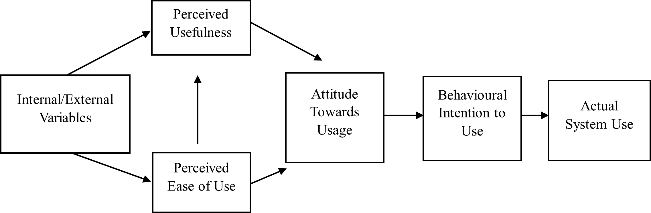
Figure 2. Adapted from “The Technology Acceptance Model (TAM) and its Application to the Utilization of Mobile Learning Technologies,” D. G. Mugo, K. Njagi, B. Chemwei, and J. O. Motanya, 2017, British Journal of Mathematics & Computer Science, 20, p. 4 (DOI: 10.9734/BJMCS/2017/29015). In the public domain.
But we also found that students valued more than just functionality. Our systematic review supported features like customization, organization, and aesthetic appeal as beneficial to student use of the course website (which contributed to higher grades and completion rates).
Quick Design Checklist
| Feature | Example | Research Support |
| Clear navigation | Weekly modules, labeled folders | Bachman & Stewart, 2011 |
| Aesthetic simplicity | Balanced colour palette, consistent fonts | Lazard & King, 2020 |
| Customization | Notification settings, adaptable layout | Younas et al., 2021 |
| Confirmation of actions | Email receipt of submissions | Hsu et al., 2022 |
| Mobile compatibility | Testing on phones and tablets | Plous, 2000 |
Collaborate with Your Students
Want the best feedback on your course webpage? Ask your students. Mid-semester feedback surveys or co-design sessions can go a long way in improving usability (Yoshida & Thammetar, 2021). I have benefited from undergraduate student input, and these translated to higher ratings for my courses.
Bottom Line: Thoughtful Design = Better Learning
Course webpage design isn’t just about looking polished—our systematic review suggests it’s a key factor in student satisfaction and learning success. Students are more likely to engage when the site is:
- Easy to use
- Clearly structured
- Visually appealing
- Adaptable to their needs
- Regularly maintained and updated
So we, as instructors, need to spend some time fine-tuning our websites. The good news is that once you do this for one course, many platforms offer cloning or importing, which makes it easy to transfer your work from one course to another.
If you’re feeling stuck, reach out to your campus teaching and learning centre, look at exemplars, or co-create the website with students. You don’t have to do it alone.
The full systematic review can be found: https://osf.io/j6xc8/?view_only=bf720f88103848578ba9e6da0013f95f
Dr. Kelly M. Babchishin is an assistant professor at Carleton University who specializes in forensic psychology. She teaches large undergraduate and graduate courses, many of which use online or hybrid formats.
Emma J. Holmes is a graduate student and teaching assistant at Carleton University (Department of Psychology). Emma is supported in part by funding from the Social Sciences and Humanities Research Council and the Ontario Graduate Scholarship.
Alexis G. Hinkson was an undergraduate student (Department of Psychology) at Carleton University and is now completing her law degree at the University of Ottawa. Alexis has served as a teaching assistant and was hired by Kelly Babchishin to assist her in course design and provided the student perspective.
References
Bachman, C. M., and C. Stewart. 2011. “Self-Determination Theory and Web-Enhanced Course Template Development.” Teaching of Psychology 38 (3): 180–88. https://doi.org/10.1177/0098628311411798.
Davis, F. D. 1989. “Perceived Usefulness, Perceived Ease of Use, and User Acceptance of Information Technology.” MIS Quarterly 13 (3): 319–40. https://doi.org/10.2307/249008.
Hsu, P. S., E. M. Lee, and T. J. Smith. 2022. “First-Year Instructor’s Designing and Teaching an Online Undergraduate Engineering Course during the COVID-19 Epidemic.” Journal of Computers in Mathematics and Science Teaching 41 (3): 215–43.
Lazard, A. J., and A. J. King. 2020. “Objective Design to Subjective Evaluations: Connecting Visual Complexity to Aesthetic and Usability Assessments.” International Journal of Human-Computer Interaction 36 (1): 95–104. https://doi.org/10.1080/10447318.2019.1606976.
Lindgaard, G., G. Fernandes, C. Dudek, and J. Brown. 2006. “Attention Web Designers: You Have 50 Milliseconds to Make a Good First Impression.” Behaviour & Information Technology 25 (2): 115–26. https://doi.org/10.1080/01449290500330448.
Plous, S. 2000. “Tips on Creating and Maintaining an Educational World Wide Web Site.” Teaching of Psychology 27 (1): 63–70. https://doi.org/10.1207/S15328023TOP2701_13.
Younas, A., C. M. N. Faisal, M. A. Habib, R. Ashraf, and M. Ahmad. 2021. “Role of Design Attributes to Determine the Intention to Use Online Learning via Cognitive Beliefs.” IEEE Access 9: 94181–94202. https://doi.org/10.1109/ACCESS.2021.3093348.
Yoshida, M., and T. Thammetar. 2021. “Education between GovTech and Civic Tech.” International Journal of Emerging Technologies in Learning 16 (4): 52–68. https://doi.org/10.3991/ijet.v16i04.18769.